Color Psychology in Branding
Color psychology in branding is not just decoration — it’s a powerful communicator. In branding, color acts as a nonverbal cue that shapes perception, evokes emotion, and can even influence behaviour. Marketers who master the psychology of color can leverage it for greater brand distinctiveness, recall, and emotional resonance.
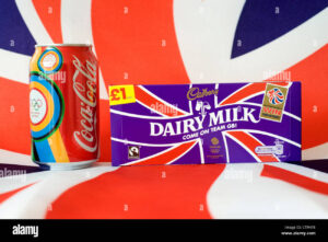
Two iconic brands—Coca-Cola and Cadbury—offer compelling case studies in how color becomes part of the brand identity itself. In this blog, we’ll explore theory, examples, and actionable lessons from their color strategies.
1. Theoretical Foundations: Why color psychology in branding
1.1 What is color psychology in branding?
Color psychology studies how colors affect human emotion and behavior. In the branding context, a color becomes a kind of visual shorthand—a cue that triggers associations (e.g. energetic, trustworthy, premium).
According to studies, consumers make up their minds about products within 90 seconds of first impression, and as much as 62–90% of that judgment is based on color alone.
However, color effects are not universal — perceptions vary by culture, context, personal experience, and even gender.
2. Coca-Cola: The Power of Red in Branding
2.1 Historical Evolution & Legacy
Coca-Cola’s association with red is nearly inseparable from its brand identity. The red color was used early on partly for practical reasons (e.g. to hide stains, to differentiate from competitors). Over decades, red has become iconic—so much that the red and white logo is globally recognizable.
2.2 Emotional & Behavioral Effects
-
Excitement & Impulse: Red is known to stimulate energy and heighten senses. It encourages strong emotional responses, making it effective for products intended to be fun, bold, or immediate.
-
Contrast & Visibility: On store shelves, red stands out among greens, blues, etc. It grabs attention even from a distance. willowandblake.com+1
-
Brand consistency & recall: Because Coke has maintained red consistently, consumers often recognize “Coca-Cola red” even without seeing the full logo. willowandblake.com+2Business Insider+2
2.3 Risks & Mitigations
-
Red, being intense, can feel aggressive if overused.
-
In some cultural contexts, red also signals danger, stop, warning.
To manage this, Coca-Cola balances red with white and soft curves in its logo, so that red feels energetic rather than harsh.
2.4 What Marketers Can Learn from Coke’s Red Strategy
-
Consistency is critical: Maintaining a signature hue over decades builds automatic recognition.
-
Contrast wisely: Pair intense colors with neutral backgrounds or accents to avoid visual fatigue.
-
Use color to support messaging: Red reinforces the ideas of “refreshing,” “bold,” and “shareable.”
-
Test across contexts: Online, print, packaging, in-store — red may shift visually, so ensure adaptability.
3. Cadbury: Purple as a Crowned Identity
3.1 Origins & Trademark
Cadbury’s use of purple (often called “Cadbury Purple”) dates back many decades. The brand reportedly adopted purple to signify premium quality, and in the early 1900s to honor Queen Victoria (purple being historically associated with royalty). Cadbury even sought trademark protection for the purple shade in relation to chocolate packaging.
3.2 Psychological & Brand Effects
-
Luxury & Premium: Purple has long been associated with royalty, wealth, and sophistication. Cadbury uses that to communicate that its chocolate is a cut above.
-
Uniqueness / Differentiation: Purple is relatively rare in FMCG / food packaging (compared to red, green, blue). That provides visual distinctiveness on shelves.
-
Emotional resonance: The plush, deep tones of Cadbury purple can evoke indulgence, imagination, comfort.
-
Brand recall & consistency: Over years, consumers come to associate that purple with chocolate, particularly Cadbury chocolate.
3.3 Challenges & Considerations
-
The purple must be carefully balanced so it doesn’t appear too juvenile or gaudy.
-
On print vs digital vs packaging, purple may shift, so color management is key.
-
Strong color trademarks can be legally controversial (some rivals may challenge them). In fact, Cadbury’s purple trademark has been subject to legal disputes.
3.4 Lessons for Marketers from Cadbury Purple
-
Pick a “less crowded” hue: If your category is saturated with red/blue/green, a rarer hue can help you stand out.
-
Align color with brand promise (Color psychology in branding): Purple’s associations (premium, imagination) fit well with the indulgence of chocolate.
-
Guard your visual identity legally: Strong color branding may need trademark protection or legal safeguards.
-
Use accents and neutrals: Purple is powerful, but used with gold, cream, white, or complementary tones, it feels richer and more elegant.
4. Caveats, Limitations & Cultural Sensitivity
-
Cultural differences: Color meanings vary across cultures (e.g. white may signify mourning in some cultures).
-
Color blindness & accessibility: Some people perceive colors differently; ensure readability and contrast.
-
Overemphasis on color: Color alone cannot carry a brand. Messaging, product quality, storytelling all matter.
-
Shifts in trend: What looks fresh today may feel dated later—so refresh carefully.
Conclusion
Color is one of the most powerful levers marketers have—but it must be wielded thoughtfully. Coca-Cola’s use of bold red and Cadbury’s purple both show that when color aligns with brand purpose, emotional tone, and consistent execution, it becomes a silent ambassador for the brand.
If you’re building or refining a brand, think of your primary hue not as decoration but as a foundational asset—something that can speak before words even arrive.
-